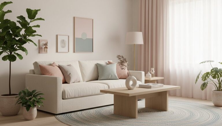
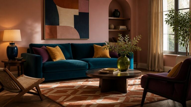
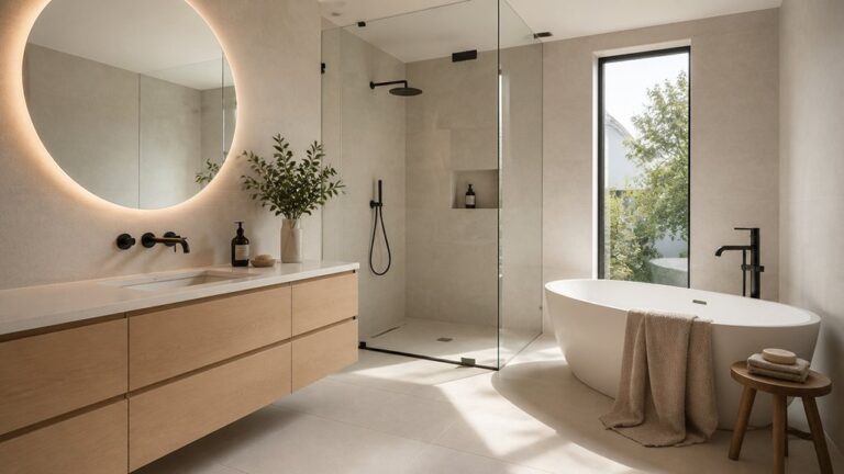
Refresh your property with a modern palette by starting with a style-fit neutral—warm white or greige for inviting spaces, dove or stone for a calmer, premium feel—then test undertones in both daylight and LEDs. Layer earthy mid-tones like taupe, clay, and muted olive through textiles and finishes, not big paint blocks. Keep it curated with 1–2 accents and a 70/20/10 balance, and upgrade impact by tinting ceilings and deepening doors. Keep going to see room-by-room combinations.
Key Takeaways
- Start with a warm or cool neutral base that suits your light, existing finishes, and the mood you want.
- Choose a palette that aligns with your home’s architectural style to keep the update intentional and cohesive.
- Limit accents to 1–2 colours and apply them strategically using a 70/20/10 distribution for a curated, modern look.
- Add depth with finish choices—tinted ceilings, darker doors, and layered natural textures like linen, oak, leather, and matte ceramics.
- Test large swatches in daylight and evening lighting to catch undertone shifts and choose the right sheen for each room.
Pick a Modern Colour Palette by Home Style

If you start with your home’s architectural style, you’ll land on a modern colour palette that feels intentional—not forced. In a mid-century space, pull from walnut, olive, and muted terracotta, then sharpen the look with matte-black hardware.
For a contemporary build, lean into Monochrome schemes—warm white walls, charcoal trim, and ink-toned textiles—so the lines read crisp and elevated.
In a Victorian or craftsman interior, keep heritage details front and centre by pairing deep jewel tones with warm metals and Vintage accents like aged brass frames or a reupholstered settee.
Coastal and farmhouse layouts suit airy blues, sandy beiges, and soft sage, balanced by clean, modern contrast in lighting and art.
Start With a Neutral Base (Warm vs Cool)

Start your refresh with a neutral base that sets the temperature for everything that follows. If you want cozy, lived-in warmth, you’ll gravitate to creamy off-whites, greige, and soft taupe.
If you prefer crisp, contemporary polish, you’ll choose clean whites, cool gray, and muted stone. Pick the direction that flatters your home’s light and finishes, then let your modern accent colors do the talking.
Choosing Warm Neutrals
Where do you begin when you want a modern refresh that still feels livable? Choose warm neutrals as your base: creamy whites, oatmeal, soft camel, and greige with a beige undertone. They read current, photograph beautifully, and make rooms feel welcoming rather than sterile.
Start with walls in a warm off-white, then layer tonal textiles—bouclé, linen, and wool—in slightly deeper sands to add depth without visual noise. If you’re styling around Vintage furniture, warm neutrals protect patina and wood tones while keeping the look edited.
Pair them confidently with Industrial finishes like blackened steel, brushed brass, and concrete; the warmth balances hard surfaces and sharp lines. Finish with matte paint and warm LEDs for consistent, flattering light.
Choosing Cool Neutrals
How do you keep a modern refresh feeling crisp without tipping into cold? Start with cool neutrals that carry depth: blue-greige, soft dove, putty, and gentle stone. Check undertones in daylight and at night—north-facing rooms love a whisper of green, while south light can handle cleaner grey.
Use Color psychology to your advantage: cooler bases read calm, focused, and premium, perfect for open-plan living and work zones. Anchor them with matte finishes and subtle texture—limewash, boucle, pale oak—to stop the space feeling sterile.
Historical palette trends also guide you: think Scandinavian minimalism and 1930s cool modernism, updated with brushed nickel and black accents. Then layer one warm element for balance: leather, brass, or terracotta art.
Check Undertones in Your Room’s Lighting
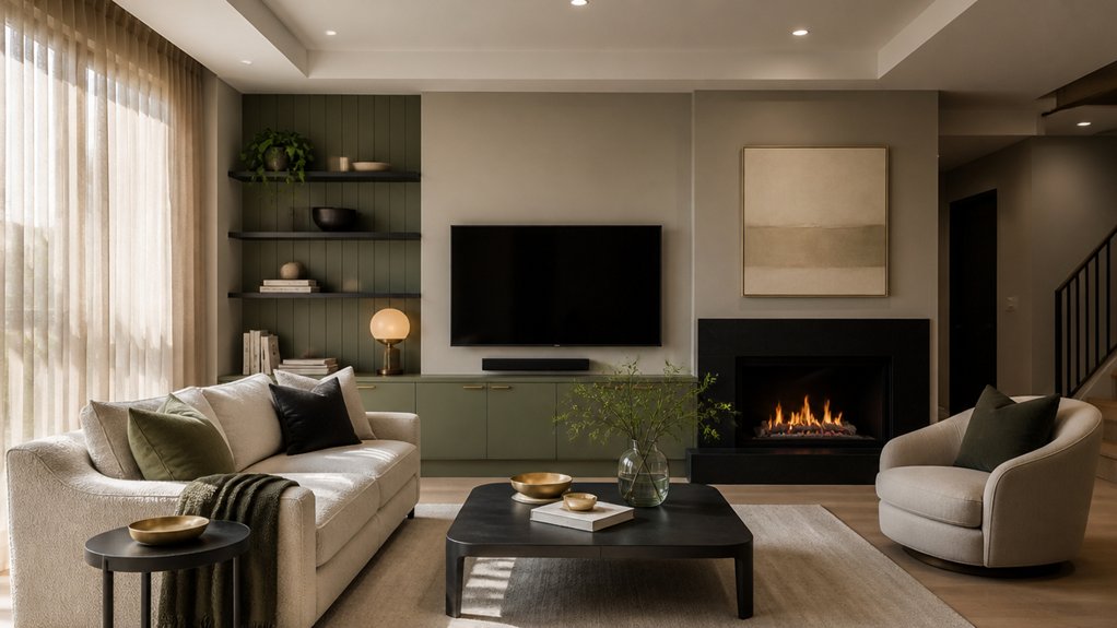
Before you commit to a modern paint color, check how its undertones shift in your room’s lighting. You’ll want to view swatches in bright daylight and again under your evening artificial mix (LEDs, lamps, and overheads) to catch any surprise casts.
Compare warm vs. cool reads side by side so you can choose a shade that stays true and on-trend from morning to night.
Assess Daylight Vs. Artificial
Even if you’ve found a “perfect” modern shade on a swatch, it can swing dramatically once daylight fades and your lamps take over. In natural light, colours read cleaner and shadows sharpen, so subtle undertones can surface on large walls, ceilings, and trim. Test your top picks on two walls, then watch them from morning to late afternoon to track shifts.
After dark, switch on every fixture you actually use: pendants, sconces, floor lamps, even under-cabinet strips. Artificial lighting can deepen pigments, mute contrast, or make neutrals look flat.
Photograph the samples at the same angles you’ll live with, and check them beside key finishes like flooring, counters, and textiles. You’ll choose a palette that stays consistent, not surprising.
Compare Warm And Cool
Where does your room sit on the warm-to-cool spectrum once the lights are on—crisp and airy, or cozy and sunlit? Toggle every lamp and overhead, then hold paint swatches against your key surfaces: flooring, trim, and upholstery.
Warm LEDs can pull greige into beige, soften whites, and amplify brass or oak; cooler lighting can sharpen blue undertones, flatten creams, and make terracotta read muddy.
Use Color psychology to match mood: warm palettes feel welcoming for living areas, while cool tones read calm and tailored for offices and bedrooms.
Compare your modern picks to Historical palettes you already own—antique rugs, inherited art, or period moldings—so the refresh looks intentional.
If undertones clash, shift one step: warmer white, cooler taupe, or balanced stone.
Layer Earthy Tones Without Darkening the Space
Although earthy tones can read heavy in photos, you can layer them in a way that still feels bright by keeping your base light and building warmth in controlled, high-impact accents. Start with warm white walls and a pale, low-contrast rug so daylight stays the hero, then introduce taupe, clay, and muted olive through finishes and surfaces, not large blocks of paint.
Prioritise Earthy textures and natural materials: linen drapery, oak or ash furniture, woven grasscloth, leather pulls, and matte ceramics. Keep saturation softened and repeat each tone at least twice to look intentional.
Balance depth with reflectance—choose honed stone over glossy marble, brushed metals over mirror chrome, and a few translucent pieces to lift sightlines. In darker rooms, push warm neutrals upward with light ceilings and consistent trim.
Choose 1–2 Accent Colours (and Where to Use Them)
How do you keep a modern refresh feeling curated instead of chaotic? Limit yourself to one or two accent colours, then repeat them with intention. Start by choosing Complementary colour pairings that flatter your base: sage with terracotta, navy with rust, or warm white with oxblood. Keep saturation consistent so the palette reads premium, not patchy.
Next, plan Colour accent placement like a stylist. Put your strongest accent where you want the eye to land: a front-door interior, a statement armchair, or a feature pendant. Use the second accent in smaller, high-touch moments—cushions, art mats, vases, and hardware—to create rhythm.
Aim for a 70/20/10 balance, and you’ll get impact without visual noise.
Use Colour to Zone Open-Plan Rooms
Even if you love the airy feel of open-plan living, colour gives you the control to define zones without adding walls. Anchor the lounge with a deeper, cocooning tone behind the sofa, then keep the dining area lighter to maintain flow. Use a tonal shift—say, warm greige to clay—to signal function without visual clutter.
Let Furniture placement do the heavy lifting: align rugs, sofas, and dining chairs with each colour field so the palette reads intentional, not patchy.
For kitchens, try a soft, washable satin on the wall near prep areas, and a calmer matte where you relax.
Finish with Window treatments that reinforce each zone: linen sheers for the sitting area, tailored blinds for dining, and a coordinated accent band to tie everything together.
Refresh Trims, Doors, and Ceilings for Contrast
When your walls move into modern territory, you’ll get the cleanest, most high-end contrast by updating the “in-betweens” too—trims, doors, and ceilings. Treat these surfaces like design features, not defaults, and your palette instantly looks intentional and architectural.
Keep baseboards and casings crisp in a soft, warmed white, or go bolder with charcoal trim accents to frame openings and sharpen sightlines. On doors, switch from flat builder white to a muted black, deep olive, or inky navy for a boutique-hotel feel, especially in corridors and entryways.
Don’t ignore the “fifth wall”: contemporary ceiling finishes like a slightly tinted white, pale greige, or a matte colour-wash can reduce glare and make lighting feel curated. You’ll tie rooms together without changing your main wall colour.
Avoid Common Palette Mistakes (Sampling, Sheen, Balance)
Before you commit to a “modern” palette, lock it in with real-world sampling, smart sheen choices, and a balanced ratio of light-to-dark so the space reads elevated instead of accidental. Paint shifts with daylight, LEDs, and surrounding finishes, so test large swatches on multiple walls and check them morning-to-night to avoid Sampling pitfalls.
Don’t rely on tiny chips; they flatten undertones and make warm greiges look pink or muddy. Next, get Sheen selection right: use matte on imperfect walls, eggshell for washable living spaces, and satin/semi-gloss only where you want crisp, reflective contrast.
Finally, balance the palette—aim for 60% light, 30% mid, 10% dark accents—so your refreshed interior feels curated, not chaotic, and buyers read it as premium.
Frequently Asked Questions
How Do I Choose Paint That Withstands Kids, Pets, and Heavy Traffic?
Choose scrubbable, high-quality acrylic or enamel paint in eggshell or satin, since it balances durability considerations with a modern sheen. You’ll get better stain resistance if you pick washable, low-VOC formulas rated for kitchens, baths, and hallways.
Use a premium primer to lock in odors and block tannins.
In kids’ rooms, go matte-washable for touch-ups; on trim, use semi-gloss enamel.
Test samples under your lighting.
What’s the Best Way to Match New Colours With Existing Flooring?
You’d think matching new paint to existing flooring is “easy”—until undertones start bossing you around. Start by identifying your floor’s undertone (warm, cool, neutral) in daylight, then pull 2–3 paint swatches with the same base for Color harmony.
Test large samples against the floor and trim at different times. For Flooring integration, echo the floor’s midtone in walls, then add a trend-forward accent one shade deeper.
How Much Paint Do I Need to Cover My Interior Efficiently?
You’ll typically need 1 gallon per 350–400 sq ft per coat, so measure wall area (minus doors/windows) and plan for two coats for a clean, modern look.
Add 10–15% extra for touch-ups and textured surfaces.
Choose your paint finish early—matte hides flaws, eggshell balances durability and sheen.
Use a color wheel to coordinate accent walls and trims, keeping the palette cohesive and on-trend.
Should I Repaint Before Selling, and Which Colours Appeal to Buyers?
Yes, you should repaint before selling if walls look dated or marked; you’ll boost offers and shorten time on market.
Choose buyer-friendly neutrals: warm whites, soft greiges, and light taupes, because color psychology signals cleanliness, calm, and space.
Add subtle contrast with charcoal or muted navy on doors or trim.
If you use Vintage palettes, keep them washed-out—sage, dusty rose, or buttercream—so they read curated, not risky.
How Can I Coordinate Interior Colours With My Home’s Exterior Palette?
Don’t reinvent the wheel: pull your home’s exterior undertones inside, then fine-tune with the color wheel.
Match warm exteriors (cream, tan, brick) with warm neutrals and soft terracottas; pair cool exteriors (gray, blue) with crisp whites and blue-greens.
Repeat the trim color for cohesion, and use accent walls to echo a front-door hue.
You’ll create a curated, on-trend flow buyers notice.
Conclusion
You’ll refresh your interior fastest when you treat colour like a curated capsule wardrobe: a clean neutral base, a few earthy layers, and 1–2 accents that do the heavy lifting. A client of mine sampled three “safe” whites; under evening LEDs, two turned icy, but one warm greige made the whole space feel bigger overnight. Use undertones, zoning, and crisp trim contrast to modernise—then avoid sheen and balance mistakes before you commit.
About the Author