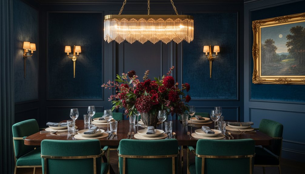
Choose rich deep colours for your dining room walls based on your light: warm-leaning navy, oxblood, or bottle green suits north light, while charcoal, aubergine, or deep teal thrives in sun. Use matte or textured paint for intimacy, then sharpen the architecture with satin or semi-gloss trim a shade off the wall. Ground the room with confident furniture and consistent wood undertones, warm it with velvet or wool curtains, and layer dimmable, candlelike lighting, brass, stone, and glass accents. Keep going to refine every finishing choice.
Key Takeaways
- Choose deep, moody paint with undertones that suit natural light, and test colours at night to confirm the mood.
- Use layered, dimmable warm lighting—pendant, sconces, and lamps—to prevent a cave effect and enhance shadows.
- Select matte or eggshell walls for intimacy, then add satin or semi-gloss trim to highlight millwork and architecture.
- Ground rich walls with confident furniture proportions, consistent wood undertones, and tactile textiles like velvet, wool, or linen blends.
- Repeat finishes and accents—aged brass, stone, glass, and art—at least twice, varying scale for cohesive, elegant drama.
Choose Moody Dining Room Colours by Light
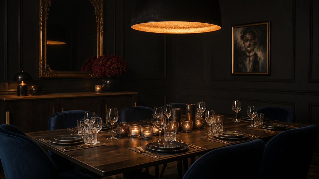
Although deep, moody hues can feel daring, you’ll get the most elegant result when you choose them in direct response to your dining room’s light. In a north-facing space, you’ll want undertones that counter coolness: inky navy, oxblood, or bottle green with a touch of warmth.
If you’re blessed with southern sun, you can lean into saturated charcoal, aubergine, or deep teal without dulling the room.
Track light across the day and let Color psychology guide you: blue steadies conversation, green softens formality, and burgundy adds appetite and intimacy.
Then refine Mood lighting to protect the pigment—layer a dimmable overhead glow with candlelike sconces so shadows look intentional, not heavy.
Paint or Panel Walls for a Dark Dining Room
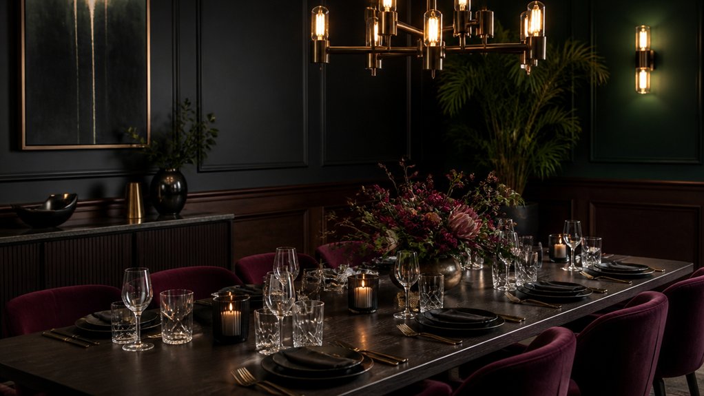
When you commit to a dark dining room, you’ll shape the mood with more than colour—you’ll choose between the sleek continuity of paint and the architectural presence of paneling.
You can fine-tune paint finishes and sheen, from velvety matte that absorbs light to satin that catches a candlelit glow and highlights crisp trim.
Or you’ll introduce paneling styles and depth—shallow beadboard for subtle texture, substantial raised panels for shadow and rhythm—so the walls feel layered rather than flat.
Paint Finishes And Sheen
Because deep, saturated hues amplify every highlight and shadow, the finish you choose matters as much as the colour itself in a dark dining room. Start with a Sheen comparison: matte absorbs light for velvety intimacy, eggshell adds a soft glow, satin sharpens edges, and semi-gloss can read formal but unforgiving under pendant glare.
If your walls show patches or seams, matte or eggshell keeps the surface calm and cohesive.
Use textured paint sparingly when you want depth without shine; it diffuses reflections and makes jewel tones feel layered, not flat.
On trim, choose satin for a clean outline that won’t look plastic.
Always test at night and by candlelight, since raking light will reveal roller marks and touch-ups.
Paneling Styles And Depth
Once you’ve settled on a finish that flatters deep colour under evening light, turn to the wall’s architecture—paneling can control shadows just as surely as sheen does.
Choose paneling patterns that sharpen the room’s proportions: tall, narrow battens lift a low ceiling, while wide frames calm a long wall behind the host’s chair. Keep profiles crisp; heavy ogees can look muddy in near-black tones.
Depth matters. A shallow 10–12mm reveal reads tailored and modern, whereas deeper 20–25mm recesses create theatrical contrast when sconces graze the surface.
Treat paneling as one of your wall texture options: painted timber for quiet refinement, fluted MDF for rhythm, or inset linen panels to soften acoustics and dining chatter.
Pick the Right Paint Finish and Trim Colour
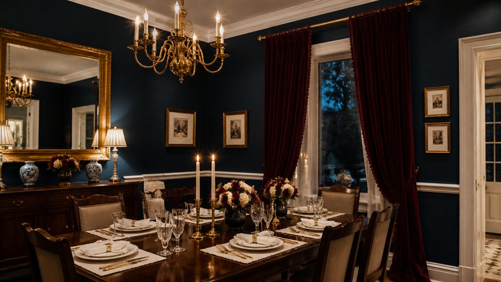
When you’ve chosen a dark wall colour, you’ll shape its mood by selecting the right finish—matte to soften and absorb light, or satin to add a refined, wipeable glow.
You can sharpen the room’s architecture with high-gloss trim accents that catch candlelight and frame doors, windows, and mouldings with crisp definition.
Keep everything intentional by matching the trim colour to the wall’s undertone, so your edges read tailored rather than harsh.
Matte Vs. Satin Sheen
Even if you’ve chosen the perfect deep hue for your dining room, the paint finish you select will decide whether it reads as velvety and intimate or crisp and reflective under evening light. A Matte finish absorbs glare, softens wall texture, and lets saturated colour look powdery, plush, and museum-like—ideal when you want candlelit depth and minimal distraction behind artwork.
Choose a Satin sheen when you need subtle luminosity and better wipeability near chairs, fingers, and serving traffic. Satin catches highlights along paneling and corners, so your colour feels cleaner and slightly more formal, especially with layered lighting.
To keep the room cohesive, match finish to function: matte on broad walls, satin on hardworking surfaces, and keep trim colour a shade lighter or deeper for quiet definition.
High-Gloss Trim Accents
Although deep, saturated walls set the mood, high-gloss trim is what sharpens the dining room’s architecture—skimming light across crown molding, window casings, and panel edges like lacquer. You’ll notice how it edits the room, crisping every junction and making door profiles read as intentional design, not afterthought.
Choose high gloss trim when you want reflective accents that feel tailored and formal. It bounces candlelight and chandelier sparkle, giving dark paint a dimensional counterpoint and preventing the perimeter from collapsing into shadow.
Because gloss magnifies flaws, you’ll need meticulous prep: fill nail holes, sand to a uniform feather, and dust thoroughly. Apply a leveling primer, then two thin topcoats with a fine roller or quality brush, maintaining a wet edge for a glass-smooth line.
Undertone-Matched Trim Color
Because deep wall colours exaggerate every cast of light, you’ll get a more polished dining room by matching your trim colour to the wall’s undertone rather than defaulting to a stark “builder white.” A blue-based charcoal reads cleaner beside a cool, slightly gray-white trim, while a merlot or oxblood looks richer against a warm, creamy off-white that shares its red or brown notes.
To choose an undertone matched trim color, compare swatches under evening lamp light and daytime sun, then pick the trim that looks quietest, not brightest. Keep the trim one to two steps lighter than the walls so profiles stay crisp without creating a hard outline.
Use a satin or semi-gloss finish to catch candlelight and highlight millwork, preserving subtle color harmony throughout your setting.
Choose Refined Dining Furniture and Wood Tones
When you anchor a deep-toned dining room with refined furniture, you give all that colour a disciplined, elegant framework. Choose a table with confident proportions—solid legs, crisp edges, and a top that reads intentional, not bulky—so the room feels tailored rather than heavy.
Match wood tones to your palette’s mood: walnut and fumed oak deepen jewel walls, while warm chestnut softens charcoal or inky green. Keep undertones consistent; mix woods only when one clearly dominates and the others repeat in small notes.
Let your chairs bring contrast through Modern silhouettes in matte black, caramel leather, or velvet. Then ground the look with Vintage accents like a carved sideboard or a cane-back host chair. Finish with hardware in aged brass or burnished nickel.
Layer Dining Room Lighting to Soften Dark Walls
As your walls sink into saturated colour, layered lighting keeps the room luminous and refined instead of cave-like. Start with ambient lighting that washes the ceiling and upper walls, easing sharp contrast and letting deep hues read as velvety rather than heavy.
Add a dimmable pendant centered over the table to anchor conversation and highlight place settings without glare.
Then build gentle accents: slim wall lights that skim art, a pair of shaded lamps on a sideboard, or discreet picture lights that draw the eye around the room. Choose warmer bulbs to flatter complex paint undertones and soften skin tones.
Finally, let decorative accessories participate—candleholders, softly glowing lanterns, and reflective trays—so light repeats in small, intimate flashes across the evening.
Add Elegant Finishes: Brass, Stone, and Glass
Although deep, saturated walls already feel luxurious, you’ll sharpen the effect with finishes that catch and refine the light—warm brass, cool stone, and clear glass. Add Brass accents in a slim chandelier stem, picture lights, or chair pulls; choose brushed or antiqued tones so the glow looks intentional, not flashy.
Balance that warmth with Stone textures: a veined marble tabletop, a honed travertine sideboard top, or a charcoal slate serving plinth. Keep edges crisp and profiles minimal to let the material read as architectural.
Introduce glass to lift the palette—smoked pendants, a faceted decanter, or a tall vase that mirrors candlelight. Repeat each finish at least twice so the room feels composed, and vary scale for quiet drama.
Use Curtains and Upholstery to Warm Deep Colours
Even if you’ve committed to inky walls, curtains and upholstery can soften the intensity and bring a welcoming warmth back into the room. Choose drapery with weight—linen blends, velvet, or wool—so it falls in generous folds and filters light into a gentle glow. Layer sheers behind heavier panels to keep the mood rich, not gloomy.
Let Textile textures do the work: a mohair chair, leather seat pads, or bouclé on a bench adds tactile relief against saturated paint. Keep Color coordination deliberate by echoing one undertone—teal, plum, or umber—across fabric, trim, and piping, then shift value slightly for depth.
If your room skews formal, add subtle pattern like herringbone or tone-on-tone stripes to keep it polished.
Style the Table and Add Art for Contrast
Once the walls and textiles go deep, you can let the dining table act as the room’s bright, intentional counterpoint. For refined Table styling, choose pale oak, marble, or crisp linen to lift the palette, then anchor it with a low, sculptural centerpiece that won’t block sightlines.
Layer matte stoneware over subtly reflective chargers, and keep cutlery streamlined so the color story stays clean. Add a single metallic note—brass candlesticks or a silver carafe—to catch evening light.
For Artistic contrast, hang a bold graphic print or luminous still life that echoes one accent tone from the table. You’ll create tension and harmony at once, making deep colors feel deliberate, not heavy.
Frequently Asked Questions
How Do I Make Deep Colours Work in an Open-Plan Dining Area?
You make deep colours work in an open-plan dining area by anchoring them to one defined zone: paint the dining wall, or use a saturated rug to “frame” the table. Keep adjacent spaces lighter for balance.
Refine your Color pairing with warm metals, creamy neutrals, and natural wood. Add Texture contrast—velvet chairs, matte paint, glossy ceramics—so the palette feels layered, not heavy, even at night.
What Dining Room Deep Colours Are Best for Small Homes With Kids?
You’ll get the best results with deep navy, charcoal, forest green, or aubergine, because they hide smudges and feel calming through smart Color psychology.
Choose washable, scrubbable finishes so you won’t stress over fingerprints.
For Furniture coordination, pair these hues with warm oak, walnut, or blackened metal, then repeat the tone in durable textiles.
Keep trim and ceilings crisp white to prevent the room from feeling tight.
How Can I Style a Dark Dining Room on a Tight Budget?
Style your dark dining room on a tight budget by choosing Budget friendly paint options like matte, scrub-resistant formulas and invigorating trim in crisp white for contrast. You’ll amplify depth with thrifted mirrors, brass-look hardware, and layered textiles—linen runners, velvet-look cushions, and a washable rug.
Add DIY wall art ideas: oversized monochrome prints, framed fabric swatches, or painted canvases in tonal gradients. Use warm bulbs and candles to soften shadows.
Which Plants Thrive in Low-Light Dining Rooms With Dark Walls?
You’ll get the best results with snake plant, ZZ plant, cast-iron plant, pothos, and Chinese evergreen; they tolerate low light and still look poised against dark walls.
For Indoor air quality, snake plant and pothos are reliable standouts.
For plant maintenance tips, water sparingly, let soil dry between drinks, wipe leaves monthly, and rotate pots occasionally to keep growth even.
Use matte planters for polish.
Do Deep Dining Room Colours Affect Home Resale Value?
Yes, deep dining room colours can affect resale value, but you’ll usually help it if you execute them well. When you toured that moody navy room that felt like a velvet box, it likely stood out—NAR reports 66% of agents say paint impacts buyer decisions.
Use color psychology to keep undertones welcoming, not heavy. Choose satin or eggshell paint finishing for wipeable elegance, and balance with bright trim, layered lighting, and art.
Conclusion
When you style a dining room in rich, deep colour, you’re composing a twilight symphony. You’ve balanced moody paint or paneling with the right finish and crisp trim, then grounded it with refined wood tones. Layered lighting pours over the room like candlelit silk, softening every shadow. Brass, stone, and glass add quiet glamour, while curtains and upholstery lend warmth. Set the table, hang contrasting art, and let the space glow.
About the Author