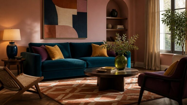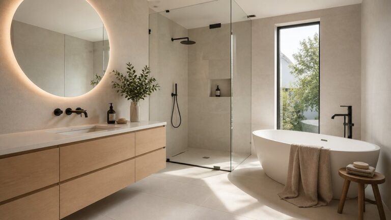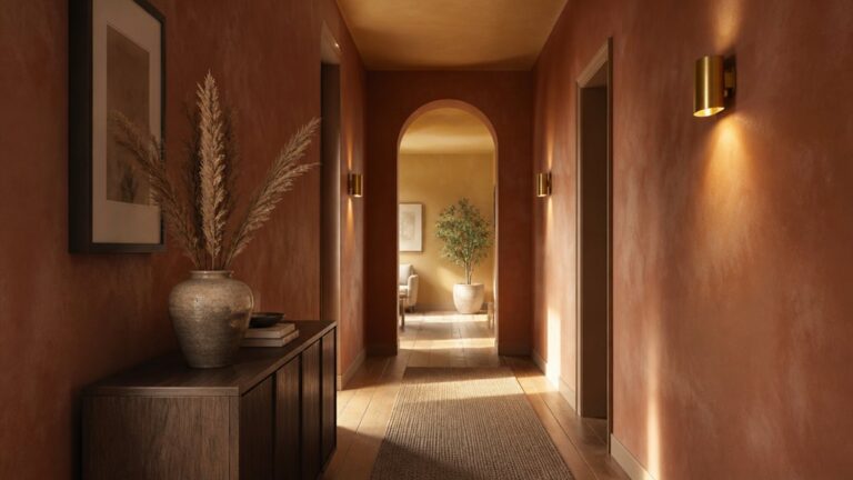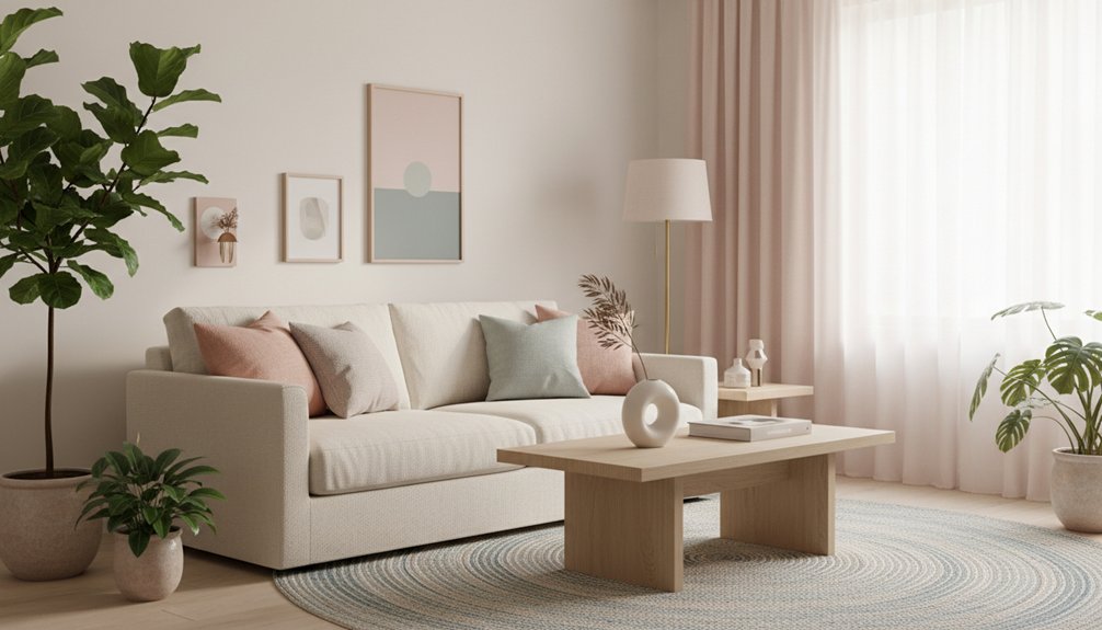
Start by matching calm muted pastels to your home’s fixed undertones—flooring, stone, and tile—then choose grayed, desaturated hues like dusty peach, misty lilac, or blue-cast eucalyptus. Build a warm neutral base with creamy off-white, oat, or light taupe across walls, rugs, and drapery, and anchor with medium oak, aged brass, or warm charcoal. Add one controlled accent per room and keep clean lines, matte finishes, and negative space—next you’ll see exactly how to place each color.
Key Takeaways
- Start by identifying warm or cool undertones from fixed finishes, then choose desaturated pastels that match those undertones.
- Build a warm neutral base on large surfaces (creamy off-white, oat, sand, light taupe) to keep pastels calm and cohesive.
- Add pastel accents sparingly per room—one or two items each—so color feels intentional without creating clutter.
- Keep the look modern with clean-lined furniture, negative space, and contrast from blackened frames, warm charcoal, or aged brass.
- Elevate pastels by layering textures and finishes: linen, slub cotton, low-pile wool, warm-grain wood, and matte metals in small doses.
Choose a Calm Muted Pastel Palette (Undertones First)
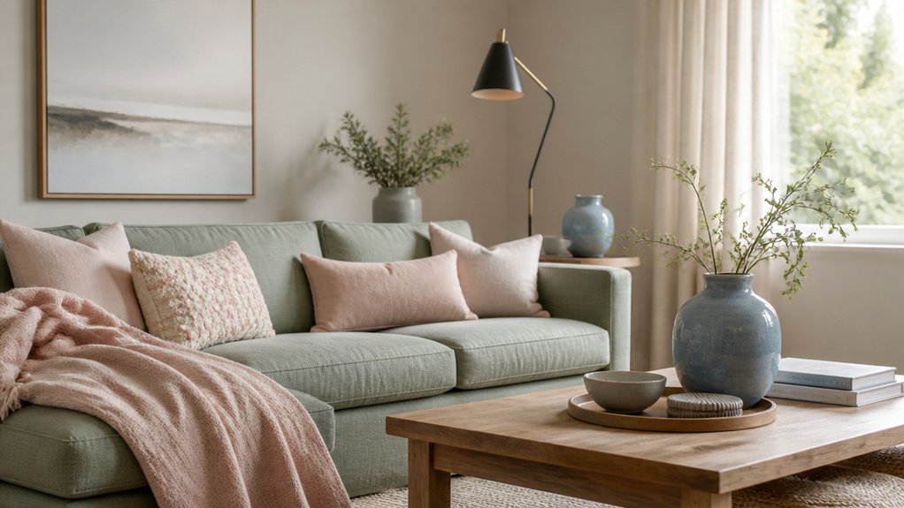
Before you pick a single “pretty” pastel, nail down the undertone that will keep your space feeling calm instead of chalky or cold. Check your fixed finishes first: flooring, stone, tile, and large upholstery. If they lean warm, you’ll want dusty peach, muted clay-pink, or buttered sage.
If they lean cool, try misty lilac, powder blue-gray, or eucalyptus with a blue cast. Use Color psychology to guide placement: greened pastels steady busy rooms, while blush lifts low-light corners without glare.
Pull swatches vertically on walls and across sightlines so the palette stays cohesive from entry to living zone. Pastels’ history proves they’re strongest when softened—choose grayed, desaturated tones that read modern, not nursery.
Build a Warm Neutral Base for Muted Pastels
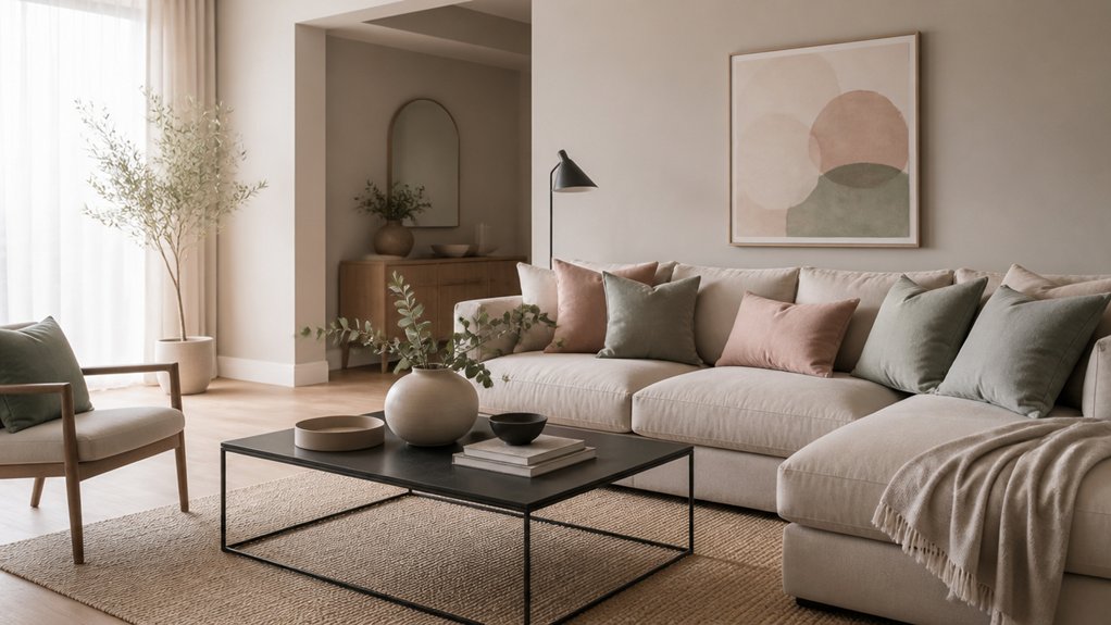
Once you’ve locked in undertones, set your muted pastels on a warm neutral base so they read intentional and modern instead of sweet or washed out. Choose creamy off-whites, oat, sand, and light taupe with a soft yellow or red bias, then repeat them across large planes: walls, rugs, and drapery.
This scale-first approach aligns with Color psychology, keeping the backdrop calming while letting pastels feel sophisticated, not juvenile. Anchor contrast with warm charcoal, aged brass, or medium oak so the room doesn’t float.
Use furniture placement to reinforce structure: float the sofa on a substantial rug, keep casegoods aligned to sightlines, and leave clear negative space around key pieces. Finish with matte or eggshell sheens to diffuse light and mute glare.
Add Muted Pastel Accents Room by Room (No Clutter)
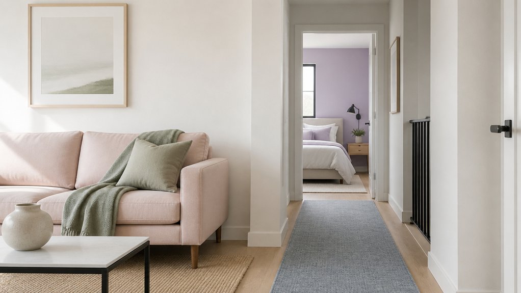
When you add muted pastels in small, deliberate doses, the palette stays modern and airy instead of drifting into clutter. Start at the entry: a dusty-sage runner or powder-blue catchall keeps the drop zone calm.
In the living room, layer one blush throw and one art print with soft-lilac notes, leaving surfaces mostly open. Use Pastel color psychology to guide function—cool tints in focus areas, warmer tints where you unwind.
In the kitchen, swap in misty-mint tea towels or pale-peach canisters, then stop.
For the bedroom, choose one linen set in muted rose and repeat it once in a bedside vase.
In the bath, try Accent wall ideas like a single painted niche or half wall in muted aqua.
Keep Muted Pastels Modern With Clean Lines and Contrast
Small pastel accents set the mood, but the modern look comes from the structure around them. Anchor blush, misty blue, or sage with crisp silhouettes: a straight-arm sofa, slim-leg chairs, and unadorned cabinetry.
Use Color psychology to guide placement—cool pastels in sightlines calm a hallway; warmer tints near seating zones invite conversation without feeling sweet.
Keep edges sharp with blackened frames, charcoal trim, or a single high-contrast rug that defines the room’s footprint.
Edit your styling into clear groupings, leaving negative space so the pastel reads intentional.
Nod to Historical design by borrowing symmetry and balanced proportions, then strip away ornament, letting geometry and contrast do the work.
Maintain consistent spacing across the room.
Layer Linen, Wood, and Matte Metal Finishes
Although muted pastels set a soothing palette, you’ll make them feel elevated by layering linen upholstery, warm-grain wood, and matte metal hardware in the same sightline—think a flax linen sofa against an oak console, finished with a blackened-steel lamp or brushed-nickel pulls.
Anchor the room with textile textures: nubby linen, slub cotton, and a low-pile wool rug that softens sound and light. Keep furniture shapes crisp—square arms, thin legs, and gently rounded corners—so the mix reads modern, not rustic.
Repeat wood tones at two heights, like a walnut side table and a light-ash frame, to guide the eye across the space. Then punctuate with matte metal in small, consistent doses: curtain rods, faucet, and cabinet knobs.
Frequently Asked Questions
What’s the Best Muted Pastel Palette for Low Natural Light Rooms?
You’ll get the best results with warm, muted pastels that don’t gray out: blush-beige, apricot, buttery cream, and soft sage, anchored by warm white.
For color pairing, keep one main wall tone, then layer two accents in textiles and art to control contrast.
You’ll boost mood enhancement by adding brass or oak, plus matte finishes that diffuse glare.
Avoid icy lilac or blue-gray—they’ll dull quickly.
How Do Muted Pastels Affect Home Resale Value or Buyer Appeal?
Muted pastels can boost buyer appeal and protect resale value when you use them like soft daylight washing across walls, making rooms feel larger and calmer.
Through color psychology, they signal cleanliness, flexibility, and modern restraint, so buyers imagine their furniture fitting in.
You’ll keep it market-safe by pairing pastels with crisp trim, warm neutrals, and minimal interior accessories.
Avoid overly sweet tones; choose dusty, desaturated shades for broad appeal.
Can Muted Pastels Work With Existing Bold Artwork or Patterned Rugs?
Yes, muted pastels can work beautifully with bold artwork or patterned rugs if you control contrast and placement. You’ll build Complementary color schemes by pulling one undertone from the rug—blush, sage, or powder blue—and echoing it on walls or upholstery.
Keep large surfaces pastel, then let saturated pieces anchor the focal wall. Use Accent decor ideas—solid pillows, matte ceramics, slim frames—to create breathing room and balance visually.
What Paint Sheen Is Ideal for Muted Pastel Walls in High-Traffic Areas?
Choose an eggshell or satin sheen for muted pastel walls in high-traffic areas; you’ll get better wipeability and scuff resistance without harsh glare. Use satin in hallways, kids’ zones, and stair landings.
Pick eggshell in living areas where you want softer light spread.
Keep Color contrast crisp with matte trim or semi-gloss doors.
Nail Texture pairing by balancing smooth paint with woven rugs, ribbed panels, and boucle seating.
How Can Renters Add Muted Pastels Without Painting or Permanent Changes?
You can layer muted pastels through removable surfaces and movable pieces, so you won’t need paint or landlord approval. Use Temporary wallpaper on one focal wall, inside bookcases, or on closet doors to control visual weight.
Add Decorative accessories like pastel linen cushions, matte ceramics, and tonal throws to anchor seating zones. Swap in blush or sage curtains, a muted rug, and warm bulbs to soften shadows and balance cool daylight.
Conclusion
You’ve probably heard the theory that muted pastels feel dated unless you go full vintage, but test it in your space: pair a dusty sage wall with warm greige upholstery, then sharpen the look with black-framed lighting and crisp, low-profile silhouettes. You’ll see the palette reads modern when undertones align and contrast stays intentional. Keep accents edited—one ceramic vase, one linen throw—then finish with light oak and matte brass to maintain calm, contemporary depth.
About the Author