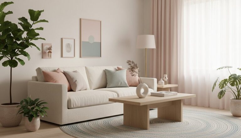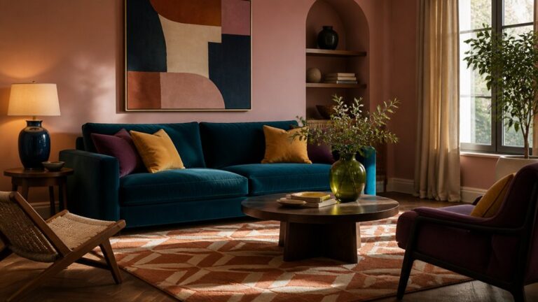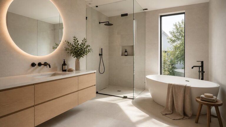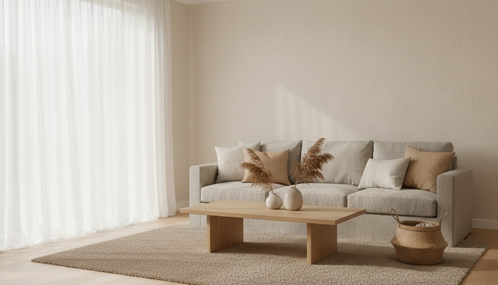
Start by watching how daylight shifts in your living room, then choose warm, cool, or balanced undertones that suit the exposure and stay consistent across paint, textiles, and finishes. Test large swatches at eye level in morning, midday, and lamplight, and pick a matte or eggshell finish for the right softness. Build a 60-30-10 palette, then layer linen, bouclé, wool, and tonal patterns for depth. Keep metals to one or two families, and there’s more to refine next.
Key Takeaways
- Assess your room’s natural light all day and choose warm, cool, or balanced undertones to keep neutrals flattering.
- Test large paint swatches at eye level in multiple spots, then review them morning, midday, and at night under lamps.
- Build a 60-30-10 palette: soft neutral walls (60), deeper taupe/stone layers (30), and high-contrast accents like black or brass (10).
- Refresh the look by layering textures—linen, bouclé, wool, ceramics, and wood—using tonal variation instead of extra colours.
- Keep undertones consistent across paint, rugs, drapes, and furniture, and limit metal finishes to one or two for cohesion.
Assess Your Living Room Light and Exposure

Before you commit to a soft neutral palette, take a close look at how daylight actually behaves in your living room throughout the day. Track morning glare, midday flatness, and late-afternoon warmth, and note where shadows pool.
A north-facing room can read cooler and more muted, while south-facing light can push neutrals brighter and crisper. Use Color psychology to gauge how light affects mood: cooler light can feel calm but distant; warmer light can feel inviting but may dull contrast.
Test large swatches at eye level and view them under lamps at night. Adjust furniture placement to avoid blocking windows, and angle reflective surfaces to bounce light.
If you’ve got heavy drapery, open it fully and reassess.
Choose a Soft Neutral Living Room Undertone
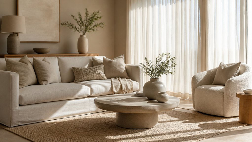
Once you’ve mapped your room’s light, choose an undertone—warm, cool, or balanced—that will keep your soft neutrals looking intentional rather than “off.” Warm undertones (creamy ivory, sand, greige with a hint of yellow or red) flatter golden daylight and make a space feel cozier.
Cool undertones (bone, stone, pale taupe with blue or green) sharpen edges and read cleaner in bright or north-facing light.
If you want a modern, layered look, pick a balanced neutral with subtle pink or olive to bridge finishes like oak, walnut, and brushed nickel.
Check your existing textiles: a beige rug with peachy flecks pushes you warm, while a slate sofa steers cool.
Undertone also controls how bold accent tones pop and how contrasting furniture feels deliberate.
Pick Soft Neutral Paint That Suits Your Lighting
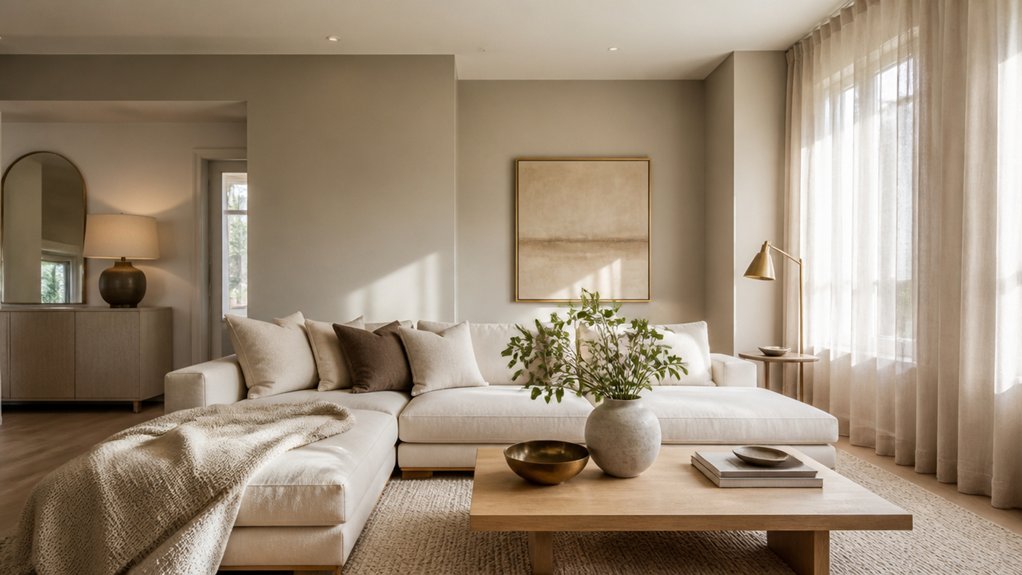
Start by evaluating how much natural light your living room gets throughout the day, since soft neutrals can shift from airy to flat as the sun moves.
Next, match the paint’s undertones to your bulbs—warm LEDs enhance creamy beiges, while cooler lighting sharpens greiges and soft taupes.
Finally, test large swatches and check them morning, afternoon, and night so you’ll see the real colour before you commit.
Assess Natural Light Levels
Two rooms painted “the same neutral” can read completely different once daylight hits, so take a clear read on your living room’s natural light before you commit.
Start by noting window direction: north light stays cooler and flatter, while south light runs brighter and can wash pale tones. East light looks crisp in the morning; west light turns warmer and moodier by late afternoon.
Track how far sunlight travels across the floor and which walls stay in shadow. Then test large swatches on multiple walls, checking them at breakfast, midday, and dusk.
Control variables with natural window treatments so you’re judging paint, not glare. If the room feels dim, plan ambient light adjustments to keep soft neutrals from reading muddy. In bright rooms, choose slightly deeper neutrals for contrast.
Match Undertones To Bulbs
After you’ve mapped daylight patterns, lock in the other half of the equation: your bulbs. Bulb selection changes how soft neutrals read, especially at night when lighting takes over.
Check your Kelvin: 2700K–3000K warms walls and can pull pink or beige forward; 3500K stays balanced; 4000K–5000K sharpens whites and can reveal green or gray.
For undertone matching, pair warm bulbs with neutrals that have creamy, taupe, or subtle peach bases, and pair cooler bulbs with greige, stone, or faint blue-gray bases.
Also note CRI—aim for 90+ so your paint looks true, not muddy.
If you mix lamps and cans, match bulb temps roomwide for a clean, current finish.
Test Paint Swatches Daily
Because soft neutrals shift dramatically from morning to night, you’ll get the most accurate read by testing swatches daily in the exact spots you plan to paint. Tape large samples to multiple walls: one near windows, one in shadow, and one behind key furniture.
Check them at breakfast, midday, and after sunset with lamps on, so you see how undertones behave under mixed lighting. Use Color psychology to guide your pick: warm greiges feel welcoming, while cool beiges read calmer and airier.
Don’t forget paint finish—matte hides wall flaws but can look flat in low light; eggshell adds a soft sheen that brightens without glare. Live with your finalists for three days before committing.
Build a 60-30-10 Soft Neutral Palette
If you want a soft neutral living room that feels intentional rather than flat, build your scheme around the 60-30-10 rule. Let 60% be your base: warm off-white, oatmeal, or pale greige on walls and larger pieces.
Use Color theory to keep undertones consistent (pink-beige with pink-beige, green-grey with green-grey) so light shifts don’t muddy the room.
Assign 30% to a secondary neutral that adds depth—taupe, stone, or mushroom—through key furnishings and casegoods.
Reserve 10% for a controlled accent: matte black, brushed brass, walnut, or muted clay. This small contrast sharpens edges, guides the eye, and creates interior balance without pushing the space into high drama or stark minimalism.
Add Texture With Soft Neutral Living Room Textiles
A balanced 60-30-10 palette gives your soft neutral living room structure, but textiles give it warmth and dimension. Start with tactile foundations: linen, bouclé, brushed cotton, or wool in off-white, oat, stone, and greige.
Then add contrast through weave, not loud color—think slubby linens, herringbone, or ribbed knits.
Use textile patterns sparingly and scaled to the room: a subtle stripe on cushions, a micro-check on an ottoman, or a tonal geometric on an accent chair. Keep color coordination tight by repeating one undertone (warm beige or cool taupe) across materials while varying sheen—matte upholstery, nubby pillows, and a smooth leather accent.
Aim for touchable, not busy, so the palette stays calm.
Layer Rugs, Curtains, and Throws Without Clashing
You can layer rugs in a soft neutral living room by mixing textures—think a flatweave base with a plush accent—while keeping undertones consistent.
Then coordinate drapes and throws by repeating one or two quiet hues (warm ivory, greige, sand) and varying the weave, not the colour.
You’ll get that curated, trend-forward look without patterns or finishes competing.
Harmonize Rug Textures
Two texture rules keep soft neutral spaces feeling intentional: vary the weave, then unify the undertone. Start with a low-pile, tightly woven base in oatmeal, stone, or greige to anchor seating and keep edges crisp.
Add Textural contrast by topping it with a smaller, plusher rug—bouclé, wool shag, or a vintage-wash flatweave—so the room feels collected, not matchy.
In Rug layering, let the bottom rug run 8–12 inches beyond the top one on all sides, and align corners to avoid a crooked look.
Keep patterns quiet: tone-on-tone geometrics or faded stripes beat high-contrast motifs.
Finally, repeat one texture elsewhere (nubby, smooth, or looped) so your mix reads cohesive.
Coordinate Drapes And Throws
Because drapes and throws sit at eye level and get handled daily, they should echo your rugs’ undertones without copying their exact color or texture. If your rug reads warm, pick oatmeal, ivory, or clay; if it’s cool, lean into stone, fog, or greige.
Choose drape fabrics that match the room’s formality: linen or cotton for relaxed, wool-blend or velvet for a tailored look. Keep the weave distinct from the rug so layers feel intentional, not busy.
For throw textures, mix matte and plush—bouclé with smooth cotton, brushed wool with a flatweave rug—while staying in one tonal family. Repeat one accent thread, like black edging or tan slub, to tie everything together.
Match Wood, Stone, and Metals to Your Palette
While a soft neutral palette sets the mood, the materials you pair with it determine whether the room feels warm and layered or flat and cold. Start by choosing a dominant undertone—creamy, greige, or taupe—then echo it in your wood accents.
Lighter oaks and ash suit airy schemes; walnut and smoked woods deepen beige rooms without fighting them.
For stone, lean into honed textures: travertine, limestone, or a quiet veined marble that repeats your palette’s warmth or coolness. Keep grout and mortar close in value for a seamless look.
Finally, edit your metal finishes to one or two families: brushed brass to amplify warmth, or satin nickel and blackened steel for a modern edge. Repeat metals in hardware, lighting, and tables.
Avoid Soft Neutral Living Room Mistakes (Flat, Cold, Bland)
Even if you love the calm look of soft neutrals, the wrong mix of undertones and textures can make your living room read flat, cold, or simply unfinished. Check your base: keep whites and beiges either consistently warm or consistently cool, then bridge small gaps with greige.
If the room feels cold, swap in warmer bulbs, creamy curtains, and a rug with subtle warmth. If it looks bland, layer texture—bouclé, linen, nubby wool, matte ceramics, and brushed metals—so light has something to catch.
Add depth with contrast: charcoal trim, a mocha coffee table, or bold accent walls in clay or deep olive. Finish with vibrant accent accessories—art, pillows, and books—repeated in threes for cohesion.
Frequently Asked Questions
How Do I Update a Neutral Living Room on a Tight Budget?
Update your neutral living room on a tight budget by moving furniture for better flow. Then swap in new pillow covers, a textured throw, and thrifted curtain panels.
Add Elegant accessories—ceramic vases, matte black trays, or brass candlesticks—to sharpen the look without clutter.
Hang Statement artwork (or frame oversized prints) to create a focal point.
Refresh with warm LED bulbs, a washable rug, and a few green plants.
Which Soft Neutral Colours Work Best for Open-Plan Living Spaces?
You’ll get the best results with warm greige, creamy ivory, soft taupe, and muted sand—tones that flow like a quiet gallery, hinting at Bauhaus restraint.
Use one slightly deeper shade for an accent wall to anchor sightlines, then keep adjacent zones lighter for airiness.
Add terracotta-tinged beige or pale mushroom for warmth.
Finish with linen textures and statement artwork to sharpen the palette without breaking cohesion.
How Can I Make Soft Neutrals Feel Cosy With Existing Colourful Furniture?
You can make soft neutrals feel cosy by letting your colourful furniture stay the focal point while you warm up the backdrop. Use textural layering: chunky knits, boucle cushions, linen drapes, and a plush wool rug to add depth.
Add accent accessories in tonal neutrals—ceramic vases, matte lamps, and woven baskets. Then echo one hue from the furniture in art or throws for cohesion.
Keep lighting warm and dimmable.
What Are the Best Soft Neutral Palettes for Renters Who Can’T Paint?
Go light, go layered, go livable: you’ll get the best soft neutral palettes by mixing warm ivory, oatmeal, and greige, or cool stone, linen, and misty taupe—no paint needed.
Use Neutral colour psychology: warm neutrals soothe, cool neutrals clarify.
Swap in slipcovers, curtains, and large rugs to set the base.
For Accent wall ideas, hang a peel-and-stick mural, oversized textile, or framed wallpaper panels.
How Do I Keep Soft Neutrals Practical With Kids and Pets?
Choose performance fabrics in oatmeal or greige, and stick to washable slipcovers so you can toss them in fast.
Layer in mixing textures—bouclé, woven cotton, and low-pile rugs—to hide wear without darkening the look.
Use patterned neutrals (micro-checks, heathered weaves) to camouflage fur and crumbs.
Keep accessorizing accents kid-proof: lidded baskets, wipeable trays, rounded ceramics, and removable cushion covers.
Opt for darker taupe throws for high-traffic zones.
Conclusion
Step back and let your living room tell you what it needs. When you read the light, choose the right undertone, and commit to a 60-30-10 mix, your neutrals stop whispering and start singing. You’ll weave in texture with rugs, curtains, and throws like layers of a well-cut outfit—nothing fights, everything flatters. Pair woods, stone, and metals with intention, and you’ll dodge flat, cold, bland—creating calm with pulse.
About the Author