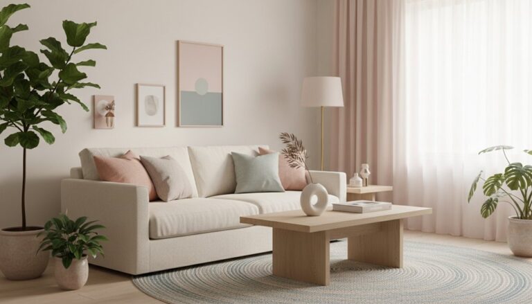
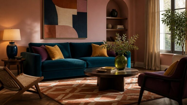
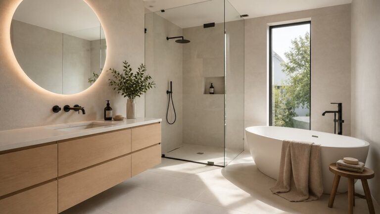
Start with what can’t change—cabinets, counters, flooring, and how daylight shifts—then pull one saturated accent from stone veining, oak grain, or terrazzo chips. Place it on a single high-impact surface like an island base, pantry door, or backsplash niche, and test large samples on vertical and horizontal planes. Balance intensity with quiet surrounds, matte vs. gloss, and crisp contrast beside pale wood or cool stone. Next, you’ll see smart ways to repeat it in hardware, lighting, and stools.
Key Takeaways
- Start with fixed elements—cabinetry, countertops, flooring, and daylight—then pull undertones from stone veining or wood grain for cohesion.
- Choose one bold focal surface, like an island base or pantry door, and keep surrounding walls and counters restrained for impact.
- Test large colour samples on vertical and horizontal planes across morning and evening light; matte absorbs, gloss reflects and amplifies saturation.
- Balance bold hues with contrast and scale: use saturated colour on smaller areas in tight kitchens, and anchor with pale wood or cool stone.
- Repeat the accent colour in backsplash details, hardware, lighting, or stools to create a deliberate, contemporary through-line without clutter.
Choose a Bold Kitchen Accent Colour That Works
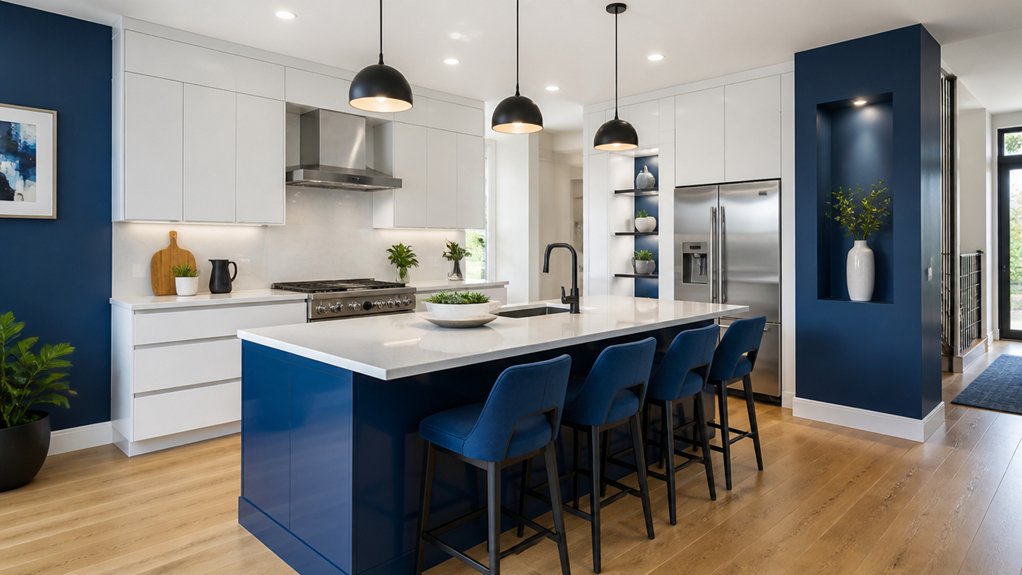
If you start with the room’s fixed elements—cabinetry, countertops, flooring, and the way daylight moves across them—you’ll land on a bold accent colour that feels intentional instead of loud. Pull undertones from veined quartz, oak grain, or terrazzo chips, then echo them in one saturated hue.
Use Color psychology to match how you cook and gather: cobalt sharpens focus, chartreuse sparks energy, oxblood adds intimacy, and clay warms conversation. Track Cultural influences, too—Mediterranean blues, Japanese indigo, or Mexican marigold can feel authentic when they reference your tableware, textiles, or family recipes.
Keep the accent spatially specific: a pantry door, island base, soffit, or backsplash niche. Test large samples at counter height, morning and evening, before committing.
Balance Bold Colour: Light, Scale, and Contrast
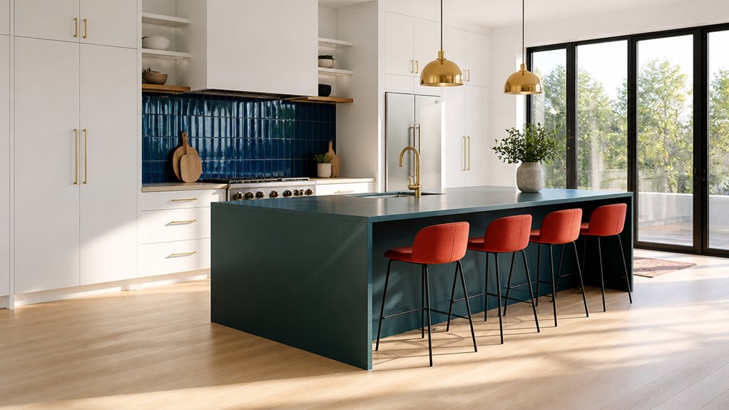
Because bold colour behaves differently under morning glare and evening warmth, you’ll want to balance it with light, scale, and contrast before you paint the first panel. Map where daylight falls, then test swatches on vertical and horizontal planes; glossy finishes bounce more, while matte absorbs and deepens tone.
Use scale like a volume knob: keep saturated hues to smaller surfaces when your kitchen is compact, and let larger blank stretches stay quiet for visual harmony. Anchor intensity with contrast—warm colour against cool stone, or vivid paint beside pale oak—so edges read crisp, not chaotic.
Apply colour psychology deliberately: energising reds need breathing room, while inky blues calm better with bright task lighting. Finally, repeat the hue in small, spaced details to guide sightlines cleanly.
Use Statement Cabinets or a Coloured Island
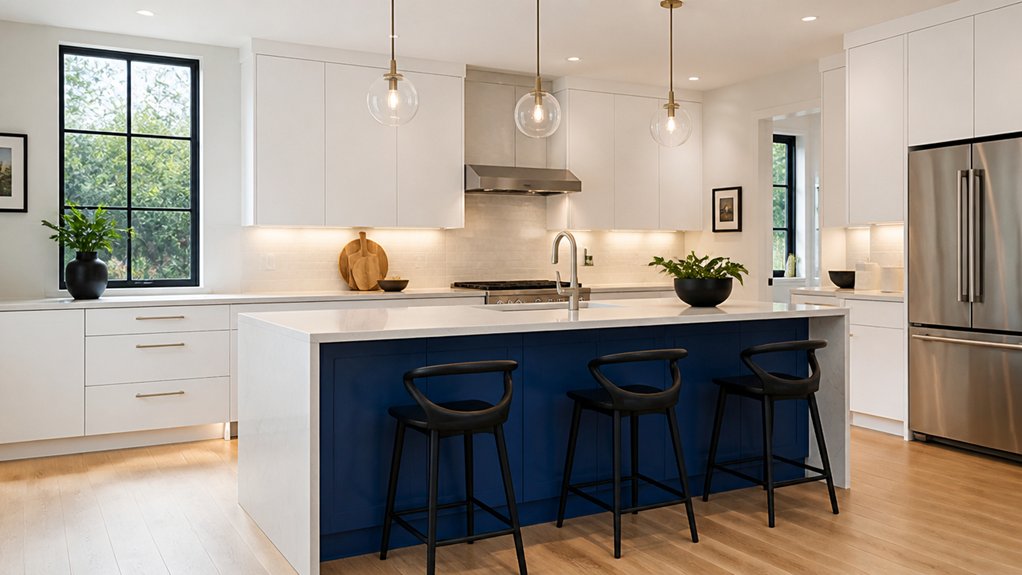
While the rest of the kitchen stays calm, you can let one major element carry the colour story—either statement cabinets or a boldly painted island. If you choose cabinets, push colour to a single run or the uppers only, so the room’s volume still feels open. Matte lacquer, stained oak in a saturated tone, or two-tone custom cabinetry keeps it current and tailored.
If you go with an island, treat it like furniture: wrap panels, add a waterfall edge, and pick a hue that reads strong from adjoining rooms. Lock in colour coordination by repeating the shade in hardware finishes, barstools, or lighting accents.
Keep surrounding counters and walls restrained, so the focal piece stays crisp and intentional.
Add Bold Colour With Backsplash Tile and Paint
Once you’ve anchored the room with calm cabinetry and counters, you can inject bold contemporary colour through a backsplash tile run and a tightly edited paint zone.
Run tile to the underside of uppers or to the ceiling for a taller sightline, then cap edges with slim trim so the colour reads intentional. Use Color psychology: cobalt sharpens focus near prep areas, terracotta warms breakfast corners, and acid green energizes a compact galley.
Choose tile texture to control glare—matte zellige softens daylight, ribbed porcelain adds shadow lines, and glossy glass bounces light deeper into the plan.
Keep paint as a frame: a saturated niche, soffit band, or window wall that aligns with tile joints. Repeat one grout tone in the paint for continuity.
Finish With Bold Lighting, Hardware, and Stools
After you’ve set the colour story in tile and paint, lock it in with lighting, hardware, and stools that read like intentional punctuation across the plan. Center pendants over the island to define the work zone, then echo their finish in under-cabinet Lighting fixtures for a layered glow that flatters saturated hues at night.
Choose Hardware styles with crisp geometry—slim pulls, knurled knobs, or mixed-metal pairings—to sharpen cabinet lines and guide the eye from perimeter to island. Keep the scale proportional: longer pulls on tall pantry doors, smaller knobs on uppers.
Finish with stools that bridge colour and form: upholstered seats in a counterpoint tone, or sculptural wood frames that warm the palette. Align seat height, leg splay, and overhang so circulation stays effortless.
Frequently Asked Questions
How Do Bold Accent Colours Affect a Kitchen’s Resale Value?
Bold accent colours can boost your kitchen’s resale value if you place them strategically and keep them easy to reverse. They can also narrow buyer appeal if they dominate.
You’ll steer perception with Accent colour psychology—navy reads premium, green feels fresh, red can overwhelm. Use accents on islands, backsplashes, or niches, not whole rooms.
Consider paint durability considerations: scrubbable finishes, stain resistance, and clean edges signal quality.
What’s the Best Paint Finish for High-Traffic Kitchen Walls?
Choose an eggshell or satin finish for high-traffic kitchen walls; you’ll get the best balance of wipeability and a soft, modern sheen. Satin boosts paint durability in circulation zones like the sink run, pantry entry, and kid-height touch points.
Use eggshell on larger, flatter expanses if you want less glare. If wall texture is heavy, skip glossy paints—they highlight peaks and roller marks in daylight.
How Can I Test Colours at Home Without Repainting Entire Sections?
Like trying on outfits before a night out, you can test colours without repainting big areas. Start with color sampling: paint large poster boards or peel-and-stick samples, then move them around—backsplash zone, beside cabinets, near the window.
Create DIY swatches in 12×12 squares, label sheen, and view them morning, noon, and under warm LEDs. Tape swatches with a shadow gap to mimic real wall edges, too.
Which Bold Colours Show Fingerprints, Grease, and Scratches the Least?
Choose bold mid-tones with soft sheen: matte navy, deep olive, charcoal teal, and dusty aubergine. These colors hide grease and micro-scratches best.
You’ll get better Fingerprint resistance on textured or powder-coated finishes than on glossy lacquer.
For Scratch concealment, pick complex, slightly muted hues and subtle speckle or brushed patterns, especially on cabinet fronts and pulls.
Avoid high-gloss black, bright white, and mirror metallics near prep zones.
What’s a Realistic Budget for a Bold-Colour Kitchen Redesign?
You’ll budget about $15k–$40k for a realistic midrange kitchen redesign.
$50k–$90k if you move walls, plumbing, or go bespoke.
Spend first on cabinetry and durable counters, then allocate for Kitchen lighting that layers task, ambient, and accent zones.
Bold finishes look sharper with matte panels and integrated pulls, but cabinet hardware styles (brass, black, mixed metals) still drive the look.
Leave 10–15% contingency.
Conclusion
Step back and see your kitchen like a modern Oz: one bold accent colour leads the eye from entry to island to backsplash. Keep it grounded with light walls, crisp contrast, and the right scale, so the space feels open, not loud. Let statement cabinets or a painted island anchor the layout, then echo that hue in tile, hardware, and stools. Finish with sculptural lighting that drops like punctuation.
About the Author