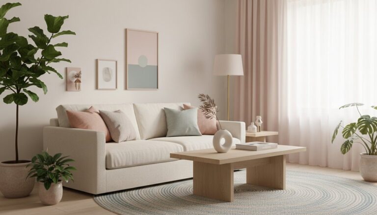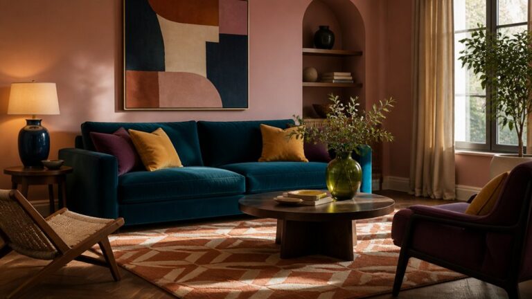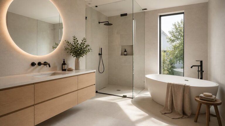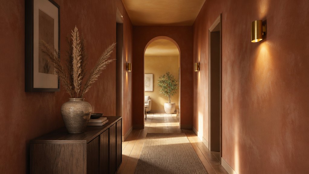
Your hallway doesn’t have to live in fifty shades of flat gray forever, thanks to warm hallway colours. You can instantly make it feel warmer and more welcoming by swapping in creamy whites, soft greiges, honeyed beiges, or even a muted terracotta that plays beautifully with wood and woven textures. The right warm tone bounces light, adds depth, and makes narrow spaces feel intentional—not like an afterthought. But before you pick a paint chip, you’ll want to check one detail that changes everything…
Key Takeaways
- Use warm LED bulbs (2700K–3000K) to keep warm paint undertones glowing; cool bulbs can dull or gray them out.
- Start with warm neutrals like creamy whites, beige, or taupe-greige to brighten halls while staying timeless and flexible.
- Choose high-LRV warm off-whites or honey-beige for narrow, dark hallways to bounce light and visually widen the space.
- Add depth with muted terracotta, clay, or cinnamon tones, especially with eggshell or limewash finishes for rich, modern warmth.
- Pair warm colours with creamy trim, brass hardware, natural wood, and olive or navy runners to replace gray with welcoming contrast.
Pick Warm Hallway Colours for Your Lighting
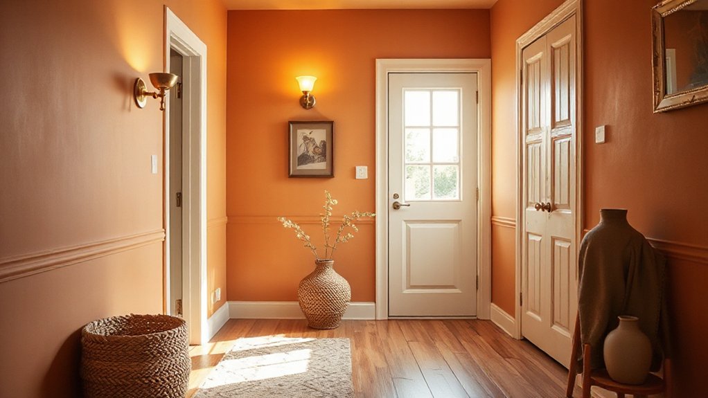
Because hallway lighting can shift a paint shade faster than you’d expect, you’ll get the best results by choosing warm colours that complement your bulbs and the way light falls through the space.
Start by checking your bulbs: warm LEDs (2700K–3000K) amplify honeyed undertones, while cooler lamps can mute them.
Use lighting techniques like wall-washing sconces or a semi-flush fixture to soften shadows and keep colour consistent from doorway to doorway.
Lean into color psychology: apricot or clay reads welcoming, caramel feels grounded, and muted terracotta adds modern depth without closing the corridor in.
Sample large swatches at eye level, then view them morning, evening, and with doors open—hallways borrow light, so your tone must stay steady.
Start With Warm Neutrals (Best Whites, Greiges, Beiges)
Once you’ve matched your paint to the way your hallway lights behave, start with warm neutrals—they’re the easiest route to a bright, pulled-together corridor that still feels inviting. Choose a creamy white with a soft yellow or peach undertone to keep trim crisp without going stark.
If you want more depth, reach for a modern greige that leans taupe, or a sand-beige that reads relaxed and elevated. Build Complementary color schemes by pairing these bases with terracotta art, olive runners, or brass hardware for an on-trend, collected look.
Don’t skip Texture and finish considerations: eggshell on walls hides scuffs, satin on doors adds polish, and a matte ceiling keeps everything calm and cohesive. Test swatches beside flooring and millwork.
Warm Hallway Colours for Dark, Narrow Halls (High-LRV Picks)
If your hallway feels like a lightless tunnel, a high-LRV warm paint colour will bounce every bit of available light while keeping the space soft, not sterile. Start with creamy off-whites, pale oatmeal, and whispery honey-beige that read sunlit even under weak bulbs.
According to Color psychology, these warm, high-reflectance shades ease tension and make tight passages feel welcoming, not rushed.
Look to Historical color palettes for guidance: think parchment, linen, and faded butter tones that have long brightened old townhomes and cottages. Choose finishes that help, too—eggshell or satin adds a gentle sheen without screaming “gloss.”
If you’ve got trim, keep it a touch lighter to sharpen edges and visually widen the corridor.
Add Depth With Terracotta, Clay, and Cinnamon Tones
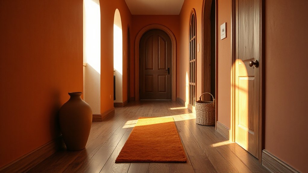
While pale warms brighten a hallway, terracotta, clay, and cinnamon shades add instant depth and a design-forward glow that still feels grounded. You’ll notice how these earthy reds and spiced browns make long corridors feel intentional, not tunnel-like, especially under warm LEDs or daylight from a nearby room.
Keep the look modern by choosing muted, dusty versions rather than orange-leaning paint. Pair them with textural wall finishes—limewash, plaster, or a soft suede effect—to amplify richness without going dark.
Then build complementary accent palettes: creamy trim, walnut frames, aged brass hardware, and blackened iron for contrast. If you’ve got wood floors, echo their undertones, and let a woven runner or vintage art bring the final layer of warmth.
Try Honeyed Yellows and Soft Ochres (Without Looking Dated)
You can modernize honeyed yellow by choosing a muted, sun-warmed shade with a soft matte finish, then pairing it with crisp white trim or warm greige to keep it current.
Use soft ochre as an accent—on a console, artwork, or a single wall—so it reads like a golden highlight instead of a throwback.
Ground both with natural wood, blackened metal, or textured neutrals, and your hallway stays bright without tipping into dated.
Modernize Honeyed Yellow Tones
Although honeyed yellows and soft ochres can read traditional at first glance, the right undertone and finish make them feel crisp, current, and intentionally warm in a hallway. Choose a honeyed yellow with a muted, slightly earthy base, not a sharp lemon, and you’ll get that sunlit glow without the vintage vibe.
Reach for an eggshell or modern matte so the colour looks velvety, not shiny. Then build Complementary colour schemes: pair it with inky navy runners, warm white trim, and touches of brushed brass for instant polish.
For Seasonal decorating tips, swap in oat-toned linens and dried grasses in fall, then crisp greenery and black accents in winter. Keep lighting warm (2700K) to preserve the honeyed depth.
Balance Soft Ochre Accents
Because soft ochre sits right between sunny and earthy, it shines in a hallway when you treat it as an accent rather than a full-on wall statement. Paint the trim, a ceiling stripe, or the back of a console niche in a honeyed ochre, then keep surrounding walls creamy linen or warm white so the color reads modern, not retro.
For balancing warm accents, pair ochre with muted clay, caramel leather, or a whisper of olive in runners and art. Anchor the look with matte black hardware or bronzed brass for a current edge.
When you’re choosing complementary textures, mix plastery paint, woven sisal, and softly grained oak to prevent that flat “schoolhouse yellow” vibe. Finish with layered lighting—warm LEDs, a glass sconce—to make the tone glow, all day and night.
Pair Warm Hallway Colours With Trim, Doors, and Ceilings
If a warm hallway colour is the star of the show, trim, doors, and ceilings set the mood around it. Keep trim a crisp soft white to sharpen clay, caramel, or terracotta walls, or go tonal with a lighter tint for a seamless, modern flow.
Paint interior doors a deeper shade—cinnamon, saddle brown, or warm olive—to add depth without cluttering the sightline. For natural lighting enhancement, brighten the ceiling with a creamy off-white that bounces glow down the corridor and makes artwork pop.
Want Accent wall ideas that feel elevated? Frame one wall with matching trim in the same warm hue, then let doors and baseboards quietly echo it. You’ll get contrast, cohesion, and a welcoming finish.
Warm Hallway Colour Mistakes to Avoid (Undertones, Sheen, Samples)
Once your trim, doors, and ceiling play nicely with a warm hallway colour, the next make-or-break details come down to undertones, sheen, and how you sample paint.
Don’t ignore undertone compatibility: a “creamy” beige can flash pink beside cool LED bulbs, while a golden tan can skew muddy next to green-leaning floors. Check the colour in morning, afternoon, and evening light, and compare it against fixed finishes.
Next, nail your sheen selection. Flat can look velvety but scuffs in high-traffic halls; eggshell hides bumps yet still wipes clean, while satin can spotlight texture under raking light.
Finally, don’t trust tiny swatches. Paint big poster boards, move them wall to wall, and view them from entry-to-end.
Frequently Asked Questions
How Do Warm Hallway Colours Affect Home Resale Value?
Warm hallway colours can boost your resale value because you help buyers feel welcomed the moment they step in. You tap Color psychology to signal comfort, cleanliness, and tasteful updates, which can translate into stronger offers.
You also create Mood enhancement, making the home photograph richer and tour better in any light. Choose soft terracotta, creamy beige, or muted honey over loud brights, and you’ll keep it broadly appealing.
What Warm Hallway Colours Suit Rental Properties With Painting Restrictions?
You’ll do best with renter-friendly warm shades that feel elevated but stay easy to approve: creamy ivory, soft beige, oatmeal, warm greige, and pale caramel. Stick to low-VOC, washable eggshell so touch-ups don’t show.
If your lease allows limited change, try decorating with warm neutrals on most walls, then experiment with using bold accent walls via removable paint, peel-and-stick panels, or a terracotta-toned runner that brings instant warmth.
Are Warm Hallway Colours Safe for People With Light Sensitivity or Migraines?
Yes, warm hallway colours can be safe for you, but you’ll want to choose them carefully. Like a soft sunrise spilling down the corridor, muted clay, creamy beige, and gentle terracotta feel cozy without shouting.
If you have light sensitivity, skip high-gloss finishes and intense, saturated oranges—they can act as migraine triggers. You’ll do better with low-sheen paint, warm undertones, and balanced lighting that stays steady, not flickery.
How Can I Use Wallpaper to Add Warmth Without Repainting?
You can add warmth without repainting by choosing peel-and-stick wallpaper in caramel, terracotta, or honeyed neutrals and applying it to one feature wall or the ceiling.
Explore wallpaper pattern options like soft stripes, botanical sketches, or tiny geometrics that feel cozy, not busy.
Layer in texture enhancement techniques: grasscloth-look vinyl, linen weaves, or embossed prints.
Finish with brass hooks and warm lighting so it all glows.
What Warm Hallway Colours Work Best With Patterned Tile or Terrazzo Floors?
You’ll get the best results with soft clay, warm white, honey beige, or muted terracotta—each lets patterned tile or terrazzo shine without fighting the speckle.
Pull one or two tones from the floor for Complementary accent shades on trim, doors, or a console.
Choose Textural paint finishes like limewash or suede-matte to add depth and hide scuffs, especially in narrow, high-traffic halls.
Conclusion
Now you’re ready to ditch chilly grays and choose warm hallway colours that actually flatter your lighting. You’ll get the best results by starting with creamy neutrals, then lifting dark, narrow halls with higher-LRV shades, or adding instant character with terracotta, clay, cinnamon, and honeyed ochres. Pair them with crisp trim, thoughtful door tones, and a ceiling that stays light and airy. Sample first, watch undertones and sheen—your hall can feel a thousand times more welcoming.
About the Author