If your living room’s feeling a little “settled,” beige might be doing more than you intended. You can shift the mood fast by anchoring your palette to one hero piece—sofa, rug, or art—then layering in plum and olive with warm wood, terracotta with deep teal, or blush and rust sharpened by matte black. Add boucle, velvet, and natural grain for depth, but keep your balance… because one small misstep changes everything.
Key Takeaways
- Choose a bold colour anchor like a sofa, rug, or art, and build paint and accents around it for cohesion.
- Match palettes to mood: sage-cream for calm, cocoa-dusty rose for cozy, or inky blue-brass for elevated drama.
- Balance light, mid, and deep values, repeating undertones in rugs, pillows, and drapery to prevent a flat, one-note room.
- Try unexpected pairings: plum with olive, terracotta with deep teal, or blush and rust with matte black for modern contrast.
- Test colours in varied lighting, and layer textures and mixed finishes—linen, velvet, jute, glossy frames—to add depth and warmth.
Choose a Living Room Colour Palette Anchor (Sofa, Rug, Art)
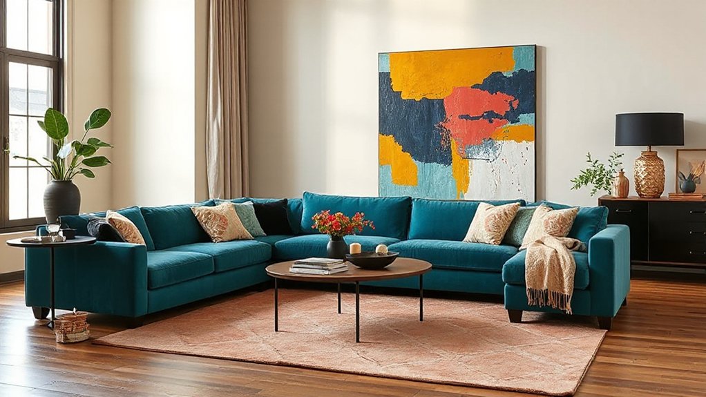
Whether you’re craving a quick refresh or a full-on style reset, start by choosing one colour anchor that sets the tone for everything else—your sofa, a statement rug, or a bold piece of art.
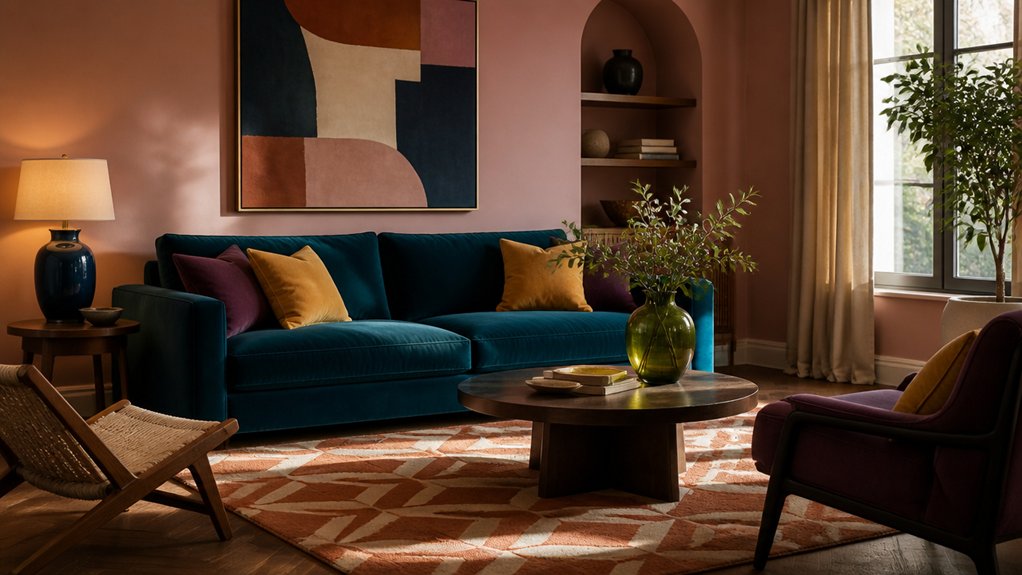
If you pick a sofa in inky teal or paprika velvet, you instantly signal a modern, confident direction. Choose a rug with unexpected lilac-and-ochre hits, and you’ll pull warmth and edge into the room without repainting.
Go for oversized art with saturated greens, then echo one pigment in cushions and ceramics for a designer-level finish.
Next, test wall color pairings against your anchor in daylight and evening; the lighting influence can shift blush to beige or navy to charcoal.
Keep the anchor dominant, accents tight, and the result looks intentional.
Quick Picker: Match Palettes to Your Living Room Mood
Now that you’ve picked your anchor piece, you can use a mood-based palette selector to lock in the vibe you want—calm, cozy, bold, or elevated.
You’ll match room energy to color the way designers do right now: soft sages and warm creams for zen, inky blues and brass for drama, or terracotta and blush for upbeat warmth.
Choose your mood first, then let the palette do the heavy lifting so your living room instantly feels more like you.
Mood-Based Palette Selector
If your living room’s vibe feels slightly off, a mood-based palette picker gets you back on trend fast by pairing the feeling you want—calm, cozy, energized, or elevated—with unexpected color combos that actually work in real homes.
You start with Color psychology: soft clay plus misty blue reads soothing, while inky teal with warm brass accents feels elevated without trying too hard.
For cozy, pair cocoa with dusty rose; for energized, try citron against deep navy.
Keep it client-friendly by sampling in your actual light and anchoring the scheme with one “always” neutral (greige, oat, or warm white).
Then choose paint finish options strategically: matte hides wall flaws, eggshell handles traffic, and satin makes trim look custom.
Room Energy Color Matches
Even when your furniture stays the same, the right palette can shift your living room’s energy in a weekend. Use this quick picker to match mood to colour, guided by Color psychology and room harmony, not guesswork.
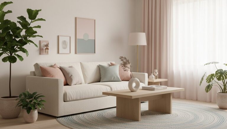
Craving calm? Try dusty sage, warm ivory, and soft clay, then add black accents for definition.
Want social sparkle? Go butter yellow, cobalt, and crisp white; it keeps conversation lively without feeling loud.
Need cozy depth for nights in? Pair oxblood with caramel and smoky taupe, then layer brass for glow.
If you’re after modern clarity, choose icy lilac, graphite, and pale oak for an airy, design-forward edge.
Keep one neutral constant, repeat your bold tone twice, and your room will feel intentional fast.
Moody Living Room Colours: Plum + Olive + Warm Wood
If you want a living room that feels rich and current, pair plush plum with earthy olive and let the contrast do the work. You’ll keep it balanced by choosing one as the lead shade and using the other in smaller hits—pillows, art, or a statement chair.
Then warm it all up with wood accents like walnut side tables, oak shelving, or a toned-down coffee table that grounds the mood.
Balancing Plum And Olive
While plum and olive can read heavy on their own, pairing them with warm wood turns the mood into something deliberately luxe and livable. To balance the duo, let one shade lead and the other support: go plum-forward for evening drama, or olive-forward for an earthy, tailored calm.
You’ll get better Color harmony when you keep undertones aligned—think blue-based plum with muted, greyed olive—then repeat each colour in at least two places so it feels intentional.
Control the emotional impact by lifting the scheme with creamy off-whites, soft brass, or smoky glass, and by choosing mid-sheen finishes that catch light without glare.
Ground it all with textured neutrals so the palette feels rich, not relentless.
Warm Wood Accent Ideas
Where can warm wood make the biggest difference in a plum-and-olive living room? Start with one hero piece: a walnut coffee table or oak media console that anchors the palette and softens the moody contrast.
Then layer smaller notes—arched wood frames, slatted side tables, or a curved floor lamp—to add rhythm without crowding the color story.
Choose personalized wood finishes that echo your undertones: amber stain warms cool plum, while a matte honey tone keeps olive feeling modern.
For a current look, mix smooth surfaces with tactile grain, and repeat wood at two heights—console plus stools or shelves.
Prioritize eco-friendly wood accents like FSC-certified pieces, reclaimed beams, or low-VOC sealants so the room feels rich, not heavy.
Warm and Earthy: Terracotta + Deep Teal
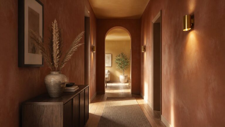
Because this duo balances sunbaked warmth with moody depth, terracotta paired with deep teal instantly makes your living room feel curated and current. You’ll get that boutique-hotel vibe without going cold or overly rustic, thanks to Complementary colour combinations that play off each other’s intensity.
Lean into colour psychology insights: terracotta reads welcoming and grounded, while deep teal signals calm confidence and sophistication.
Use terracotta on walls, a statement sofa, or textured ceramics, then anchor the room with deep teal in velvet cushions, a painted bookcase, or oversized art. Keep the palette modern with warm neutrals—sand, camel, and creamy white—so the contrast stays refined.
Finish with aged brass lighting, walnut accents, and a patterned rug that ties both tones together seamlessly.
Modern Contrast: Blush + Rust + Matte Black
Terracotta and deep teal bring rich, earthy drama, but if you want something sharper and more fashion-forward, blush, rust, and matte black deliver instant modern contrast.
You’ll get softness, warmth, and edge in one tight trio that reads curated, not cute.
Use Color theory principles: blush acts as a gentle tint, rust anchors with mid-tone saturation, and matte black adds high-contrast structure. Keep black to 10–20% so it outlines rather than overwhelms—think window frames, a metal coffee table, or graphic lighting.
Layer blush through velvet cushions or a tonal rug, then bring rust in leather, clay, or artwork to deepen the room.
For historical palette inspiration, borrow from Bauhaus neutrals and 1970s desert hues, then modernize with clean lines and minimal patterns throughout.
Bright but Livable: Saffron + Cobalt + Crisp White
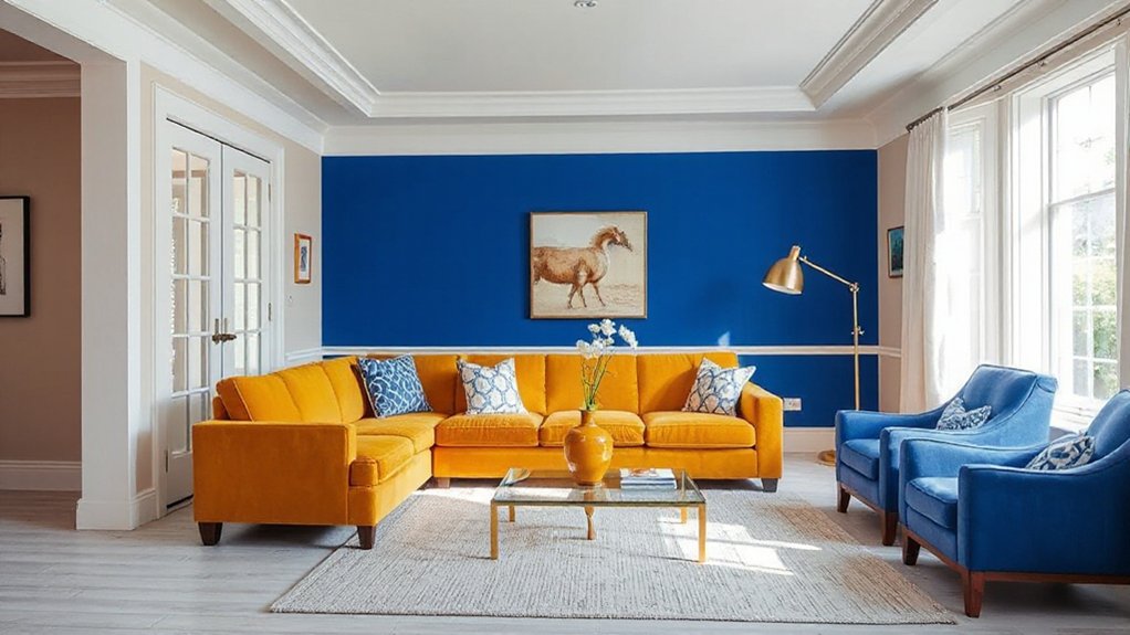
If you want a living room that feels sunlit and editorial—without turning into a playroom—pair saffron, cobalt, and crisp white for bold energy that still reads polished.
Use saffron as the glow: a velvet accent chair, textured pillows, or an art print that catches afternoon light.
Drop cobalt in with intention—one statement sofa, a lacquered side table, or graphic drapery—so it anchors the room and sharpens the palette.
Keep crisp white on walls, ceilings, and larger rugs to give everything breathing space and a gallery-clean finish.
Color psychology says saffron boosts optimism while cobalt signals confidence, so you’ll feel uplifted, not overstimulated.
For furniture coordination, mix warm woods with chrome or black details for modern balance.
Calm and Airy: Sage + Sand + Cream
When you want your living room to feel lighter and more pulled-together, sage, sand, and cream deliver that calm, airy “quiet luxury” look without reading flat. You’ll get freshness from sage, grounded ease from sand, and lift from creamy whites that soften edges and reflect light.
Use color psychology to your advantage: sage cues restoration, sand signals stability, and cream keeps the mood open and welcoming. Paint walls a muted sage or keep them cream and bring sage in through linen drapery, a velvet accent chair, or art with botanical notes.
Layer sand via jute, oak, or boucle upholstery to add texture and warmth. For interior harmony, repeat each shade at least twice, and mix matte and nubby finishes so the palette feels curated, not bland.
Tailored and Timeless: Navy + Camel + Brass
A navy, camel, and brass palette brings instant “custom-made” polish to your living room—crisp, confident, and never trying too hard. You’ll get Navy sophistication without the heaviness when you pair deep inky walls or a velvet sofa with camel versatility in leather, linen, or a tailored wool rug.
Brass finishes add the glow that keeps the scheme feeling current, not corporate. Try a camel accent chair beside a navy sectional, then repeat brass through a statement floor lamp, frame set, or sculptural side table.
Keep silhouettes clean, mix matte and shine, and let texture do the talking—bouclé, burnished metal, and smooth hide. The result reads elevated, worldly, and ready for guests.
Balance Your Living Room Colour Palette (Paint, Textiles, Art) and Avoid 5 Common Mistakes
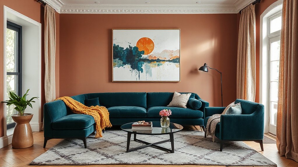
Even though you’ve picked a palette you love, it can fall flat in the living room unless paint, textiles, and art share the workload. Use walls to set the undertone, then repeat it in rugs, pillows, and drapery for a layered, designer look that feels intentional.
Avoid five common mistakes:
1) going all-in on one shade—add a light, mid, and deep value;
2) ignoring Color psychology—cool hues calm, warm hues energize;
3) skipping lighting considerations—north light mutes, warm bulbs amplify;
4) forgetting contrast—pair matte paint with nubby textiles and glossy frames;
5) treating art as an afterthought—pull one accent from artwork and echo it twice.
That’s how your palette reads curated, not chaotic, and still feels like you.
Frequently Asked Questions
How Do I Choose Paint Sheen for Bold Living Room Colours?
Choose your sheen by balancing drama, durability, and how light hits your walls.
For bold colours, a matte paint finish gives rich depth and hides flaws, perfect for low-traffic zones.
Use eggshell or satin where you need wipeable performance; sheen effects amplify colour and highlight texture.
Go semi-gloss on trim to sharpen contrast and look current.
Test large swatches in day and night lighting before committing.
What Lighting Temperature Makes Saturated Palettes Look Most Natural?
You’ll get saturated palettes looking most natural under neutral-warm color temperature lighting: aim for 3000K–3500K.
Test the theory that “daylight bulbs always win”—you’ll see 5000K can sharpen Lighting effects and push reds magenta, greens electric.
Instead, layer 2700K lamps for evening coziness and 3500K overheads for daytime clarity.
Use high-CRI (90+) LEDs so pigments read true, not flat.
How Can Renters Add Colour Without Painting Walls?
You can add colour fast without painting by layering removable pieces that pack punch. Try Temporary wallpaper on a single accent section or behind shelving for a high-impact, low-commitment vibe.
Swap in Colorful accessories—pillows, throws, art, and ceramics—in a tight palette so your space feels styled, not busy.
Bring colour down to the floor with a bold rug, and up with vibrant lampshades and curtains.
Which Accent Colours Photograph Best for Video Calls and Social Media?
For video calls and socials, you’ll photograph best with jewel accents—teal, emerald, cobalt, and burgundy—plus warm neutrals like camel; they flatter skin and avoid glare.
Like a modern siren guiding your feed, these hues keep you luminous, not washed out.
Try Accent wall ideas: a velvet throw, art grid, or peel-and-stick panel behind you.
Use Colour harmony tips: pair jewel tones with off-white, black, or brass.
How Do I Coordinate an Open-Plan Living Room With Adjacent Room Colours?
Coordinate your open-plan living room by choosing one dominant wall color and repeating it in the adjacent room at a lighter or deeper shade for a seamless Color progression.
Keep floors and large upholstery consistent to lock in furniture harmony.
Then layer each zone with its own trending accent—olive in one, terracotta in the other.
Use shared metals and woods, and echo textiles across both spaces so it’s cohesive, not matchy.
Conclusion
Now you’ve got everything you need to go beyond beige and make your living room feel brand new. Anchor your palette with a sofa, rug, or art, then dial in the mood—moody plum and olive, earthy terracotta and deep teal, or sharp blush, rust, and matte black. Layer boucle, velvet, and warm wood for depth, and balance paint with textiles and accents. One smart swap can feel like a million-dollar makeover.
About the Author